Showing posts with label Interior Design. Show all posts

Tuesday, March 13, 2012

SketchUp Pro Case Study: Alexander James International

We recently came across some marvelous work from Alexander James International (AJI), an interior design firm in the UK that specializes in the Hotel & Leisure market. Michael Reekie, Senior Interior Designer for AJI, was good enough to provide some insight into how they use SketchUp Pro.

I started using SketchUp Pro about five years ago. At that time we considered it a tool to help produce quick 3D line drawings of small areas. Gradually, its value has become more apparent and with the recent addition of Shaderlight, it is now considered to be an invaluable tool by the whole design team.

At the earliest stages of the design concept, I import a CAD plan of the project into SketchUp from which I build a model. It gives us a three dimensional awareness and makes space planning both easier and more accurate.

The SketchUp model offers better awareness of space which aids in the design and in space planning.

I continue to use SketchUp Pro throughout the design process, periodically using a fast, low resolution Shaderlight render to check the progress of lighting levels, features, furniture, and finishes.
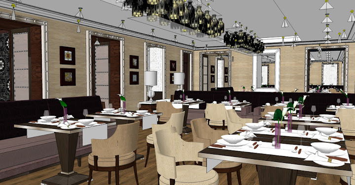
SketchUp model with entourage and Shaderlight lighting elements, when rendered, will help validate the design, look and feel.

When I am sure that no other changes are necessary I produce a high resolution rendering which is imported into Photoshop. I can then make any small changes to colours or light levels and add people or anything else that I feel would enhance the final visual.

Final Render: SketchUp Pro + Shaderlight + Photoshop

Before using SketchUp I produced hand-rendered visuals. The uncomplicated nature of the program has made the transition easy and very effective. SketchUp has become an invaluable tool for the whole design team.

A big thanks to Michael Reekie (michael@aji.co.uk) and the whole AJI team for providing this snapshot into their SketchUp workflow. Great work!

Monday, January 23, 2012

CustomMade: A community design marketplace

Here’s an interesting twist on our Make Ideas Real project: sometimes great designs aren’t your ideas. The good folks at CustomMade.com have developed a marketplace that connects roll-up-your-sleeve makers with people who have project ideas they want to bring to life. (Editor's Note: CustomMade is part of the Google Ventures portfolio.) Have an idea for a one-of-a-kind armoire? On CustomMade there are about 3,000 contractors who can help you bring that idea to life.

"Kari’s Armoire," contracted, designed and sold on CustomMade.com, Michael Colca

Of course, if you’re one of those designers and you find yourself competing with 2,999 others, affordable and efficient design software is a pretty key resource. Enter SketchUp. CustomMade’s CEO Mike Salguero recently shared a few compelling projects that were brought to life using SketchUp:

White Oak and Wenge coffee table, Jon S Manss

Sure enough, SketchUp plays a critical role in not just the design of CustomMade projects, but in the collaborative conversations between clients and artisans. Jason Hernandez, of Jason Andrew Designs, uses SketchUp to fuel the ideation and iteration process between clients and contractors: the end result, a project that both parties can buy into.


Posted by Mark Harrison, Community Manager

Message from CustomMade.com
Have you started designing your dream project with SketchUp? Post a project description on CustomMade’s “Get it Made” job board and upload .skp files as attachments. Artisans interested in building your custom project will have the chance to experience your inspiration in 3D and contact you. Let the collaboration begin!

Monday, December 12, 2011

SketchUp Pro Training Schedule: Jan/Feb 2012

Our January and February 2012 SketchUp Authorized Training Center schedule is now available. The map below contains information on specific locations, dates, and courses provided:


View in a larger map

Tuesday, November 22, 2011

Getting a better view of small interior spaces

When you’re modeling a small room, it can be a pain to see what’s inside. The problem is that the walls and ceiling get in the way. One solution is to lop off the ceiling and work in a top view, dollhouse-style. Other folks set up scenes from the interior corners and adjust their Field of View to something super-wide like 90 degrees.

Looking at a small interior space from the outside isn't very rewarding.

Deleting the ceiling and switching to a top view is useful, but fiddly.

Standing in the corner and making your Field of View really wide is just weird. What are you—a housefly?

Both of the above techniques work—to a point. Personally, I think it’s like trying to read a book through a keyhole. By far my favorite method for working on small interiors is to make use of SketchUp’s ability to have faces with different materials on each side:

The face separating Susan and Sang is yellow on one side and green on the other.


Creating a completely transparent material and painting the green side makes it see-through.

The Entity Info dialog box shows that the selected face is yellow on the front and see-through on the back.

By painting the outward-facing surfaces with a see-through material—one whose opacity is set to 0%—I can see in from the outside. Super useful, super simple.

Here, I painted all of the outward-facing surfaces with a transparent material. Notice that the interior surfaces still look opaque?

Orbiting around my model, I can see through all of the walls. I can even see through the floor.

Wednesday, November 9, 2011

Introducing Maxwell for Google SketchUp

Among rendering die-hards, the name “Maxwell” has long been synonymous with jaw-dropping realism. Maxwell Render’s makers have offered a SketchUp-to-Maxwell solution for a few years, but it required modelers to have access to Maxwell Render Suite—the full, standalone version. For SketchUppers on a budget (or who only need to make the occasional rendering), this wasn’t an ideal arrangement.

A delicious Maxwell render by Rune Skjøldberg.

To accommodate more people, the folks behind Maxwell have just released something they’re calling Maxwell for Google SketchUp. It’s a dedicated photo-renderer, based on the venerable Maxwell rendering engine, that operates entirely inside of SketchUp. Best of all, it has the Big Three qualities going for it:

  • Cross-platform. It works on both Windows and Mac systems.
  • For both free and Pro. It works on both SketchUp and SketchUp Pro.
  • Two entry points. There are free and licensed versions available.

As you can see in this straightforward feature matrix, the free version allows you to render in Draft mode and limits your resulting image to a resolution of 800 pixels. The Licensed version adds Production mode (faster rendering of complex lighting) and increases your maximum output resolution to 1920 pixels. At only $95/75€, the paid version is a bit of a bargain.

Another render by Rune Skjøldberg showcasing multiple light sources.

If you’re looking for all the bells and whistles and extra pixels that Render Suite offers, the “bridge” plugin for sending your SketchUp model to R.S is still available. So really, SketchUp modelers who want Maxwell’s delicious, unbiased results have three options. And they’re all good ones.

Posted by Aidan Chopra, SketchUp Evangelist

Wednesday, November 2, 2011

How do you make ideas real with SketchUp?

Every week, two million people use SketchUp to breathe life into their ideas. The resulting 3D models get made into houses and schools, movie sets and aquariums, bridges, robots, and furniture. The sum total of all this work represents a larger, yet untold story of how the SketchUp community is profoundly shaping the world around us.

Well, it’s time for all you unsung SketchUp heroes to stand up and take a bow, so today, we’re kicking off the Make Ideas Real project. The result of this initiative will be an innovative, online showcase that does justice to the impact SketchUp users are having on the physical world.

But we need your help to pull this off.

Make Ideas Real with SketchUp

Here’s how you can pitch in: Use this form to tell us your SketchUp story. Send us an image of a SketchUp model with an accompanying photograph that shows your completed project. Anything goes for subject matter; architecture, archeology, industrial design, construction, woodworking, personal fabrication, model railroading, mousetrap design — as long as SketchUp helped you make it, we want to see it. Professionals, semi-professionals and proud amateurs are all welcome.

Here are three examples of what we mean:

City Lights Residence, Steve Oles


SKPR Bot, John Bacus


Stand Up Desk, Dave Richards and George LaRue Downing

Over the next few months, we’ll curate the submissions we receive, and in 2012, we’ll launch a special showcase of SketchUp users who are reimagining the spaces we inhabit. Please share your story with us, so we can share it with the world.

Posted by Gopal Shah, SketchUp team

Tuesday, October 4, 2011

Speed Up SketchUp: Use Fast Styles

You might not realize that the display settings you choose to apply to your models can affect SketchUp’s speed and general responsiveness. Turning on fancy edge effects and other doodads will slow you down when your model gets big.

When you’re working on a big model, you want to make sure that you’re using a style whose Edge Settings panel looks like the one in the image below. Everything but "Edges" should be turned off.

The Face Settings panel is where you can choose not to display Transparency. When Transparency is turned on, SketchUp has to redraw your model on the screen several times—each time you change your viewpoint. If you don’t need to see through your windows just now, opt to temporarily view these faces without transparency.


The Background Settings panel is handy for turning off Sky and Ground, both of which cause your computer to do extra thinking while you’re working.


Unless you absolutely need them, you should use the checkbox in the Watermark Settings panel to turn off Watermarks.


The only toggles in the Modeling Settings panel you really need to worry about are the ones for Hidden Geometry and Section Planes. Obviously, you shouldn’t have wither of these displayed if speed is what you’re aiming for.


Once you’ve configured your own fast style, you should save it. Just give it a new name (I suggest “Fast Style”), hit Enter, and click the Create New Style button in the Styles Browser. You new style is saved in the "In Model" collection of styles, which is only associated with the model you’re currently working on.


Incidentally, almost all of the choices in SketchUp’s Default Styles collection are so-called “Fast styles” — their Edge Display settings are already configured for speed. Choosing any one of these styles will switch off extraneous effects.


Make a Fast Scene

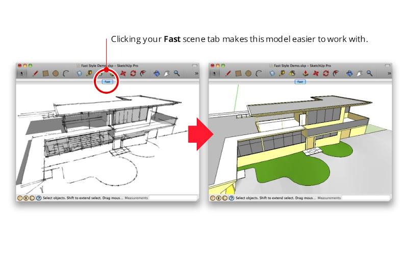
True SketchUp whizzes invariably go one step further and add a special “Fast” scene that they can activate whenever they need to. Rather than having to mess with the Styles Browser every time they want to activate their Fast Style, they just click a scene tab at the top of the modeling window. This Fast scene is usually set up to do three things: Switch to a Fast style, turn off Shadows, and turn off Fog.

Follow these steps to add a Fast scene to your model:

  1. Apply a Fast style to your model by choosing it from the Style Browser’s Select tab.
  2. Make sure Shadows and Fog are both turned off. These toggles are in the View menu.
  3. Choose Window > Scenes to open the Scenes Manager.
  4. Expand the Scenes Manager by clicking the Show Details button in the upper right corner.
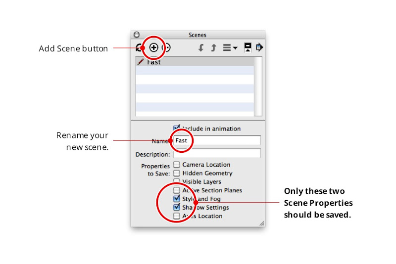
  5. Click the Add Scene button to add a new scene to your model.
  6. Rename your new scene “Fast” (or something similarly descriptive) and hit Enter on your keyboard.
  7. Make sure that only the “Style and Fog” and “Shadow Settings” checkboxes are selected in the Properties to Save section of the Scenes Manager.

From now on, all you have to do is click the "Fast" scene tab when you want to improve SketchUp's performance. Instant productivity boost!

Wednesday, September 14, 2011

Scaling imported raster images in LayOut

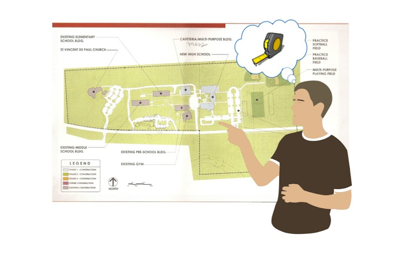
If you’ve ever inserted an aerial photo or an old scanned site plan into LayOut, you might have wanted to give it a specific scale on the page. My favorite technique for doing this uses the Clipping Mask feature.

Step 1
Choose File > Insert... to insert a raster image into your LayOut document. Find a known measurement somewhere on your image. This known measurement can be anything: a scale bar (if you’re lucky); the length of a fence or sidewalk; or even the roofline of a building. It’s important that you find something that’s relatively large and that whose length you already know. You’ll use this portion of the image as a “benchmark” to size the entire image to a specific scale.

In my example, a scale bar was included in my image; this makes it pretty easy to use as a benchmark.

Step 2
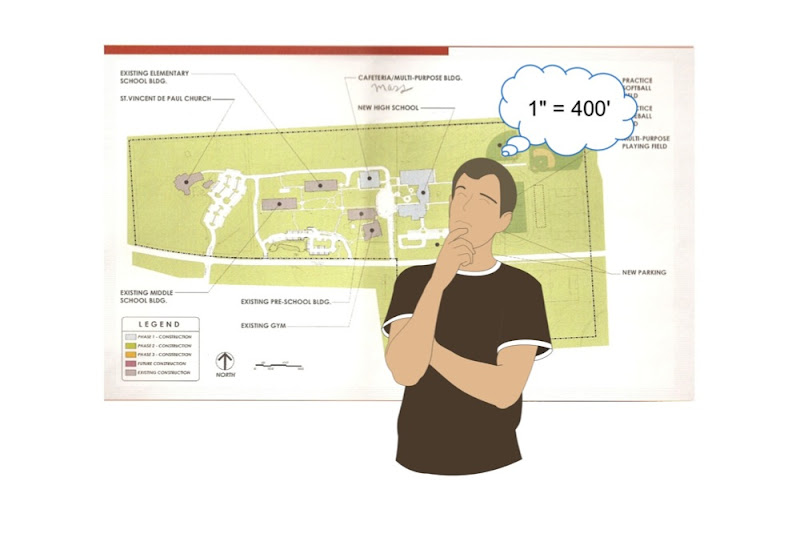
Figure out what scale you’d like to give your inserted image. Keep in mind how the scale will impact the size of the image and how that image will fit on your page.

For this image, I’m going to use 1” = 400’ (1:48) scale. This should fit nicely on an 8.5 x 11 sheet of paper.

Step 3
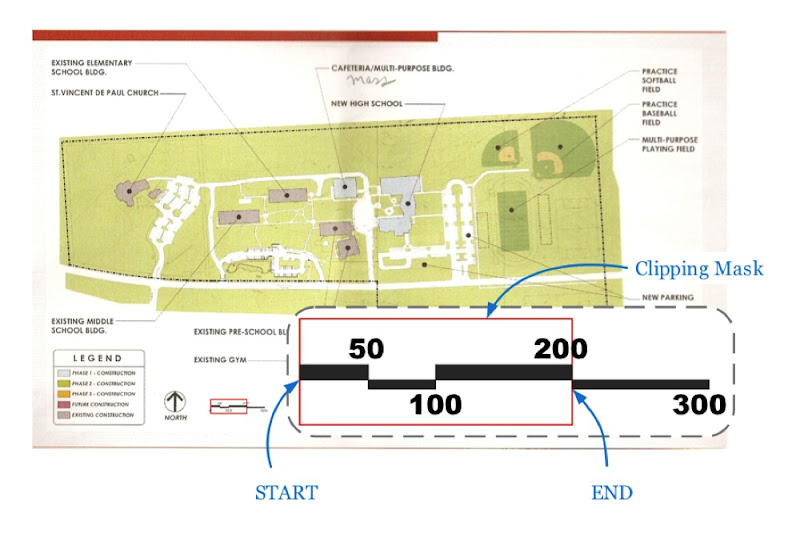
Create a rectangle around the “benchmark” portion of your image. Use the Rectangle tool to do this, and make sure it has no fill (so that you can see through it.)

This scale bar only goes to 300’, so I’m going to use the 0’ - 200’ as my benchmark. 200 is half of 400, which makes the mental math easier to do.

Step 4
Select both your rectangle and your image and choose Edit > Create Clipping Mask. Select the resulting crop and give it a visible stroke so you can see its boundary.

I color the clipping mask to make its border easier to see.

Step 5
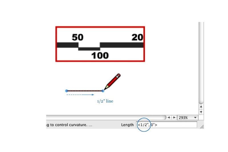
Somewhere on your page, use the Line tool to draw a line whose length corresponds to the scale of the image you’re working on.

To draw a line, click to start drawing, move your cursor in the direction you want the line to go, type the length you want and hit Enter.

Since I want a scale of 1” = 400’, and my “benchmark” is 200’ feet long, I draw a horizontal line which is one-half inch long (1 inch divided by 2).

Step 6
Move your benchmark, snapping its lower-left corner to the left endpoint of your line. Be sure that Object Snap (Arrange > Object Snap) is turned on, or snapping won’t work properly.

I snap my benchmark to the left endpoint of my line.

Step 7
Scale your benchmark so that it’s the same length as the line. With your benchmark selected, hold down the Shift key and scale it until it snaps to the right endpoint of your line. As long as you hold down Shift, your selection should scale proportionately.

I scale my benchmark to the right until it aligns and snaps to the end of my line.

Step 8
Select the benchmark and choose Edit > Release Clipping Mask. Delete the rectangle from Step 3, and the line you drew in Step 5, and you’re done. Voilà! You’ve set your image to a specific scale.

Image set at 1” = 400’ (1:48) scale and positioned on a letter-sized landscape sheet.

This may seem like a lot of steps but it’s actually pretty simple. Have a look at the following silent movie to see how it’s done.


Wednesday, September 7, 2011

Shaderlight V2 is now available

Our friends across the pond at Shaderlight would very much like you to know that they’ve just released Version 2 of their intuitive, affordable rendering tool for SketchUp. I’m no rendering guru, and I certainly haven’t tried all the alternatives, but I can truthfully say that Shaderlight is responsible for the only successful photo-realistic rendering I’ve ever made. That (and a soupçon of Photoshop) resulted in the following less-than-masterful example of stunning SketchUp realism:


The important things to note are that a) I’d never rendered a 3D model before, and b) this only took me a couple of hours to figure out. Photo-realistic rendering is still far from easy, but Shaderlight gives dopes like me a fighting chance.


The newest version of Shaderlight includes two major new features. The first is something called Replace Me. It lets you model with low-poly “proxy” objects, but then specify deliciously high-poly substitutes that Shaderlight uses when it renders. You get the best of both worlds: speedy performance in the model and better realism in the render.

The other new hotness is Rendered Animations. Shaderlight can use SketchUp’s scene-based animation settings to automatically create a photo-rendered video. Too cool. Congrats to the team at ArtVPS on getting this update out the door. It looks great.

Until the end of September, new customers can save 25% on Shaderlight Pro licenses. The promo code to use at checkout is 09PROMO.

Sunday, September 4, 2011

A treasure trove of textures

If you’re into such noble pursuits as geo-modeling or photo-realistic rendering, there’s a good chance that you spend a ridiculous amount of time hunting for photo-textures online. Flickr and other photo sharing sites are goldmines for content, but who has time to compile a folder of bookmarks that point to the best ones?

Our friend John Pacyga, apparently. He’s just posted a long list of his favorite texture sources — for both SketchUp and Photoshop. Some are free, some have Creative Commons licenses, and some cost money, but all are worth browsing. Set aside some time, though; this kind of thing is addictive.

If you’ve found a seamless texture (one that can repeat attractively when you paint it on a surface), here’s how you load it into SketchUp:

Instructions for Windows:

Instructions for Mac:


I found the rock texture in the screenshots above on lee.ponzu’s Flickr Textures set. Want to make your own seamless texture images? These tutorials on YouTube are a good place to start.

Wednesday, August 17, 2011

Speed Up SketchUp: Extrude curves with fewer sides

The most sure-fire way to mitigate your model’s geometric complexity (its count of faces and edges) is to pay attention to extruded circles and arcs. Experienced modelers know that curves in SketchUp are actually constructed out of multiple, straight edges. By default, circles have 24 sides and arcs have 12 sides. Zoom in and you’ll see what I mean:

By default, circles you draw in SketchUp have 24 sides.


Arcs you draw in SketchUp are 12-sided by default.


When you extrude a default, 24-sided circle with the Push/Pull tool, you create a cylinder with 26 faces. Choosing View > Hidden Geometry shows the smoothed edges between the faces:


Turning on Hidden Geometry shows a default cylinder for what it really is: a 24-sided extruded polygon.


Using two default arcs and the Follow Me tool to create an fancy bullnose along the perimeter of a rectangular countertop yields no fewer than 90 new faces:


Using the Follow Me tool to extrude compound curves made out of default, 12-sided arcs results in seriously high polygon (face) counts. Thumbs-down -- this is bad SketchUp practice.


Modeling a simple bike rack using a combination of 24-sided circles, 12-sided arcs and Follow Me, then placing ten of those bike racks in your design, adds more than 86,000 entities (faces and edges) to your model. Oof.


A single bike rack made by extruding a 24-sided circle along a path made from 12-sided arcs. Unless you're designing the bike rack itself, there's no call for adding this much geometry to your model.


A close-up of the high-polygon bike rack. Individual faces and edges are made visible by turning on Hidden Geometry. Images like this one cause expert SketchUp modelers to have nightmares.


The Solution


To dramatically reduce the amount of geometry in your models, change the number of sides in your circles and arcs before you extrude them into 3D shapes. It’s easy:

1) Create a circle or an arc using the appropriate tool.

2) Before doing anything else, type “6s” and hit Enter.

This tells SketchUp to draw the curve you just created using six sides. The “s” tells it that you’re changing the side-count and not the radius. Of course, you don’t have to choose six sides — you can type in any number you like.


Change the number of sides in the circles and arcs you draw. I know, I know -- a hexagon isn't a circle. Suspend your disbelief in order to have usable models.


Note: Once you’ve manually changed the number of sides in a circle or an arc, every subsequent circle or arc you draw will have that same number of sides.

I modeled the bike rack below using 5-sided circles and 6-sided arcs. It only has 322 faces -- an 89% reduction over the bike rack I modeled using curves with the default number of sides.


Crafting a bike rack by extruding a 5-sided circle along a path with 6-sided arcs yields a perfectly usable model with substantially fewer faces and edges.


When it’s used as context in my model, can you tell the difference between the “high-poly” (geometrically heavy) and low-poly versions? I thought not.


Is the quality difference between the high-polygon (top) and low-polygon versions of the bike rack worth making your model twice as heavy? Nope.


Related Posts Plugin for WordPress, Blogger...