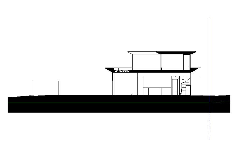
Showing posts with label LayOut. Show all posts

Wednesday, October 3, 2012

Creating a plan of your SketchUp model in LayOut

Earlier this year, we shared a snapshot of how architect Nick Sonder uses SketchUp Pro and LayOut to work up construction documents. In comments on this blog and our YouTube channel, we noticed that folks wanted to learn more about the ins and outs of this process, so we tapped Paul Lee, author of “Construction Documents using SketchUp Pro & LayOut“ to walk through the basic process for porting SketchUp scenes to plan views in LayOut:

Creating a plan in LayOut is a snap. In this tutorial we will take a pre-formed model, apply a Section Cut and create a Plan Scene for display in LayOut. Below is a view of a house construction model you can download from here. Once you've opened this model (or one of your own), select the Section Plane tool from the Tools menu. Use this tool to align the desired sectioned view of the model. (Remember: Hold down the shift key to maintain alignment while positioning your section cut.)
With your model queued up, you're ready to slice and dice with the Section Plane tool
Sectioning a SketchUp model

Under the Camera Menu, Set the view to Parallel Projection; notice that you've now provided straight-on view for your plan. Next, under Window, select the Scenes console. (Tip: you can hide the Section Plane itself in your LayOut document by opening the Styles window in SketchUp, and editing the default style of your scene to hide the section plane).

Now click on the “+” button and create a scene called “PLAN”. Open LayOut and access your SketchUp model by selecting File > Insert. From here, simply right-click on the SketchUp window and select Scenes: “PLAN”. Then right-click and go to Scale = 1mm:50mm. Your scaled plan is now finished in LayOut, and you're all set to start dimensioning and annotating the important details.

Setting up your plan as a scene in prep for LayOut

Voila: a SketchUp scene imported to LayOut

Posted by Paul Lee, Viewsion Virtual Environments, SketchUp ATC

This tutorial is based on techniques found in Paul's new book “Construction Documents using SketchUp Pro & LayOut” available here from SketchUcation and also on the Viewsion Authorized Training Center website.

Thursday, July 19, 2012

Telling the full story with SketchUp Pro and LayOut

We often describe SketchUp as both design and communication software. Some folks don’t get the communication element, but for anyone who needs to share and collaborate with clients or partners, the fluid nature of SketchUp Pro and LayOut is essential.

Recently Nick Sonder, who runs a one-man shop for architectural design, sat down with us to talk about how he uses SketchUp Pro through the entire design process: using one 3D model as the basis for interior and exterior detailing, as well as for robust, unified, and precise construction documents used by contractors.


Posted by Mark Harrison, SketchUp Marketing

Monday, December 12, 2011

SketchUp Pro Training Schedule: Jan/Feb 2012

Our January and February 2012 SketchUp Authorized Training Center schedule is now available. The map below contains information on specific locations, dates, and courses provided:


View in a larger map

Wednesday, September 14, 2011

Scaling imported raster images in LayOut

If you’ve ever inserted an aerial photo or an old scanned site plan into LayOut, you might have wanted to give it a specific scale on the page. My favorite technique for doing this uses the Clipping Mask feature.

Step 1
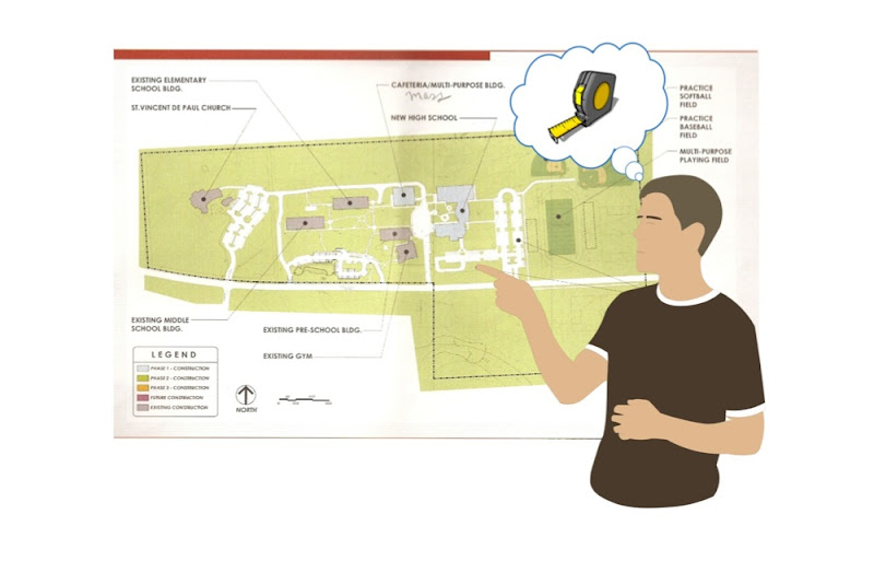
Choose File > Insert... to insert a raster image into your LayOut document. Find a known measurement somewhere on your image. This known measurement can be anything: a scale bar (if you’re lucky); the length of a fence or sidewalk; or even the roofline of a building. It’s important that you find something that’s relatively large and that whose length you already know. You’ll use this portion of the image as a “benchmark” to size the entire image to a specific scale.

In my example, a scale bar was included in my image; this makes it pretty easy to use as a benchmark.

Step 2
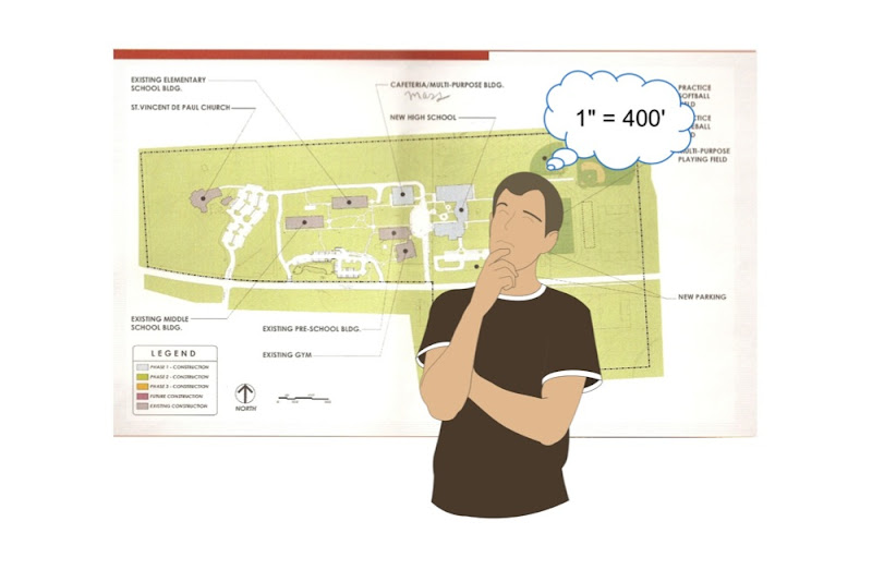
Figure out what scale you’d like to give your inserted image. Keep in mind how the scale will impact the size of the image and how that image will fit on your page.

For this image, I’m going to use 1” = 400’ (1:48) scale. This should fit nicely on an 8.5 x 11 sheet of paper.

Step 3
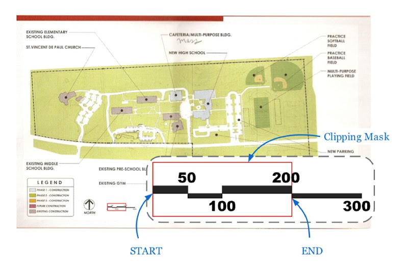
Create a rectangle around the “benchmark” portion of your image. Use the Rectangle tool to do this, and make sure it has no fill (so that you can see through it.)

This scale bar only goes to 300’, so I’m going to use the 0’ - 200’ as my benchmark. 200 is half of 400, which makes the mental math easier to do.

Step 4
Select both your rectangle and your image and choose Edit > Create Clipping Mask. Select the resulting crop and give it a visible stroke so you can see its boundary.

I color the clipping mask to make its border easier to see.

Step 5
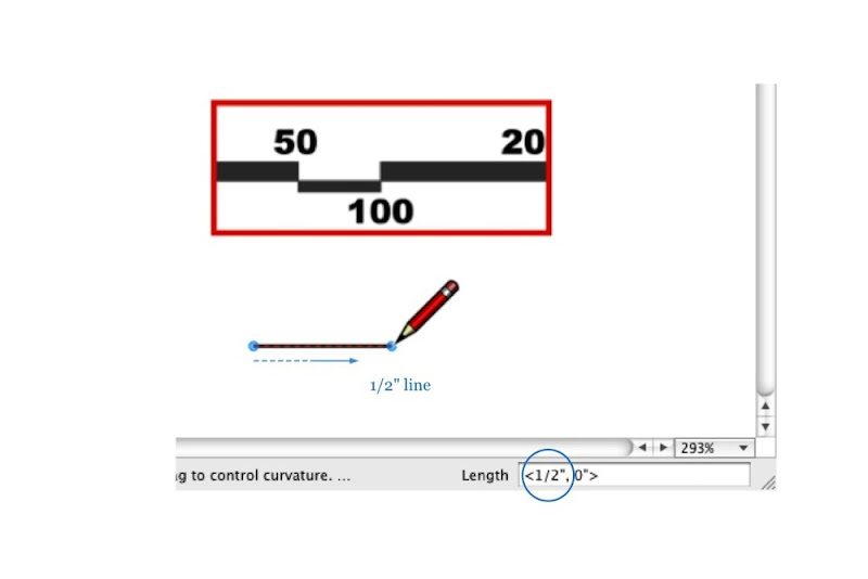
Somewhere on your page, use the Line tool to draw a line whose length corresponds to the scale of the image you’re working on.

To draw a line, click to start drawing, move your cursor in the direction you want the line to go, type the length you want and hit Enter.

Since I want a scale of 1” = 400’, and my “benchmark” is 200’ feet long, I draw a horizontal line which is one-half inch long (1 inch divided by 2).

Step 6
Move your benchmark, snapping its lower-left corner to the left endpoint of your line. Be sure that Object Snap (Arrange > Object Snap) is turned on, or snapping won’t work properly.

I snap my benchmark to the left endpoint of my line.

Step 7
Scale your benchmark so that it’s the same length as the line. With your benchmark selected, hold down the Shift key and scale it until it snaps to the right endpoint of your line. As long as you hold down Shift, your selection should scale proportionately.

I scale my benchmark to the right until it aligns and snaps to the end of my line.

Step 8
Select the benchmark and choose Edit > Release Clipping Mask. Delete the rectangle from Step 3, and the line you drew in Step 5, and you’re done. Voilà! You’ve set your image to a specific scale.

Image set at 1” = 400’ (1:48) scale and positioned on a letter-sized landscape sheet.

This may seem like a lot of steps but it’s actually pretty simple. Have a look at the following silent movie to see how it’s done.


Wednesday, July 27, 2011

Formatting text in LayOut on a Mac

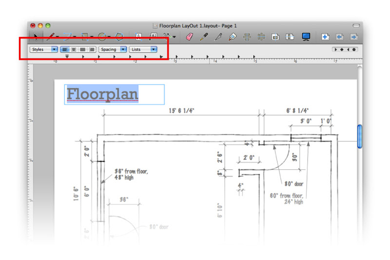
If you happen to be using LayOut on a Mac, there’s a menu item that you might’ve missed: Choosing Text > Show Rulers displays the Mac operating system’s default ruler at the top of the screen. More interestingly, it adds a few typographic controls that are otherwise hidden.


Selecting a piece of text (when your ruler is visible) reveals drop-down menus for Paragraph Style, Alignment and Spacing, as well as preset settings for bulleted and numbered lists. Windows users can access list formatting controls in the Text Style dialog box.

Compared to the last tip I wrote, this one was quick, eh?

Saturday, July 16, 2011

Making doors look right in different ortho views

While I was putting together this post last month, it dawned on me that doors are represented differently in plan, elevation and sectional orthographic views of a building. By which I mean:
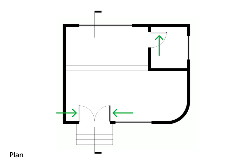
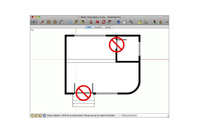
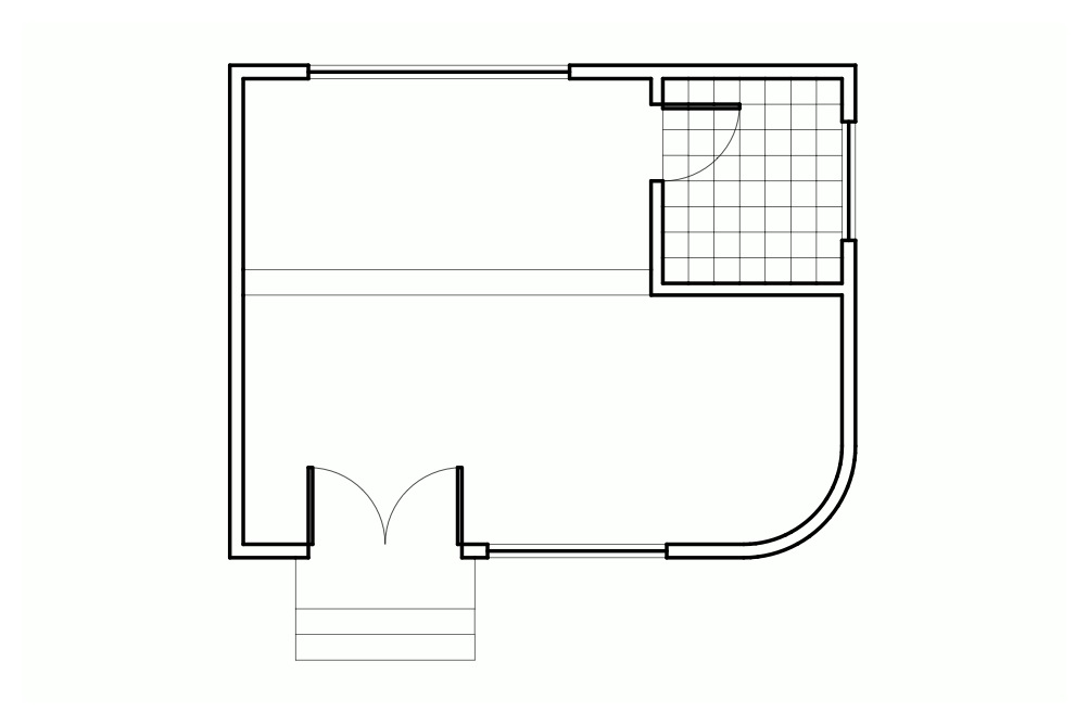
  • In plan, doors are generally shown in the open position.
  • In elevation, doors appear closed.
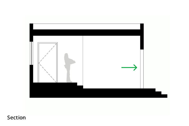
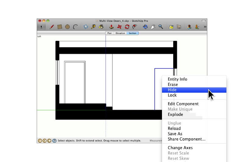
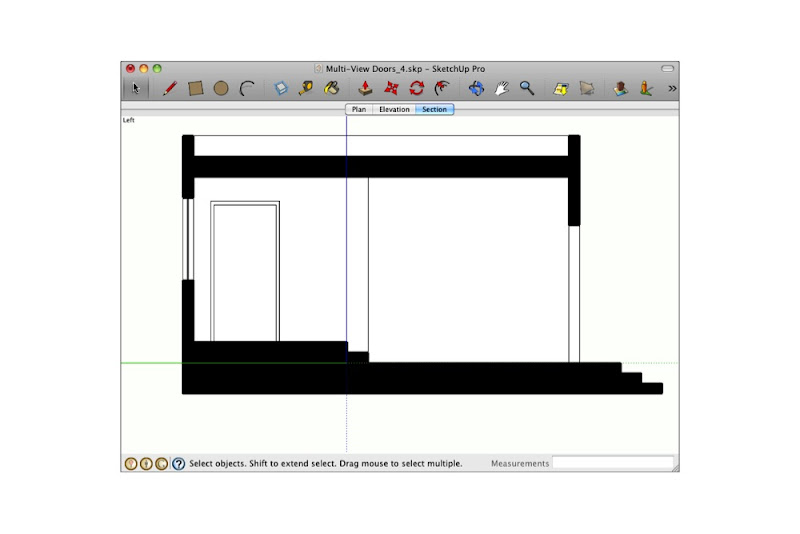
  • When cut through in section, doors disappear altogether.
In plan, doors appear open to show their swing. In the above image, the swing arcs, section cut graphics and arrows were added in LayOut.

In elevation, doors appear closed. Otherwise, you'd be able to see through them, which would be visually confusing. The scale figure and the dashed lines to indicate the hinge position were added in LayOut.

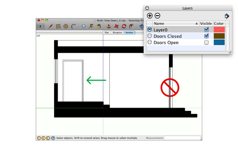
In sectional views, doors which are cut through don't appear at all. All that is visible of the doorway in the above section is the edges of the wall beyond the cut. Doors which appear in elevation (like the one on the left) are shown closed.

If I’m modeling a building and I leave the doors open, they’ll look correct in plan but not in other views. If I close them, the plans will look wrong. Clearly, I need two sets of doors—one open, one closed—and I need to manage which set is visible in each view. Layers, Scenes and nested components to the rescue!

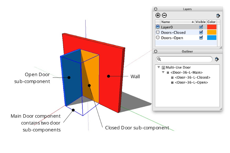
The idea here is to create a door component that includes two sub-components: one that’s an open door, and one that’s a closed door. Mine looks something like this:

A door component which includes both open and closed door sub-components, each on its own layer. In the image above, "Color By Layer" is turned on to better illustrate the setup. The Outliner dialog box shows the nesting relationship of the three door components.

Creating a combination door component

Start by modeling both doors and turning them into a set of nested components:

Step 1
Create the hole into which you want to insert a door.

Make the hole exactly the same size as the door you're planning to model.

Step 2
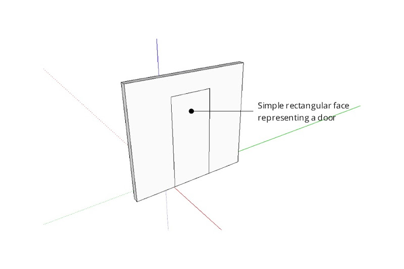
Model a door in the closed position. Keep it simple; a rectangle is fine for now.

Fill the doorway opening with a simple face. Make it flush with the side of the wall into which the door will open.

Step 3
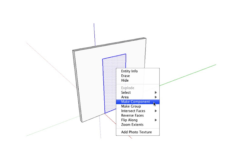
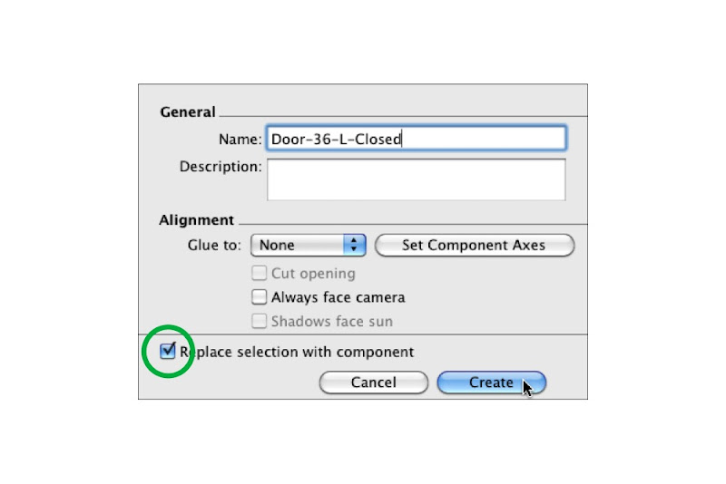
Select only the door geometry and turn it into a component. Give it a meaningful name that describes its size, orientation and position like “Door-36-L-Closed”.

Turn your simple door into a component by selecting its geometry and right-clicking to open a context menu.

Give your door component a meaningful name; "36" indicates the width and "L" indicates the left-hand hinge position. Make sure the "Replace selection with component" checkbox is selected before you click Create.

Step 4
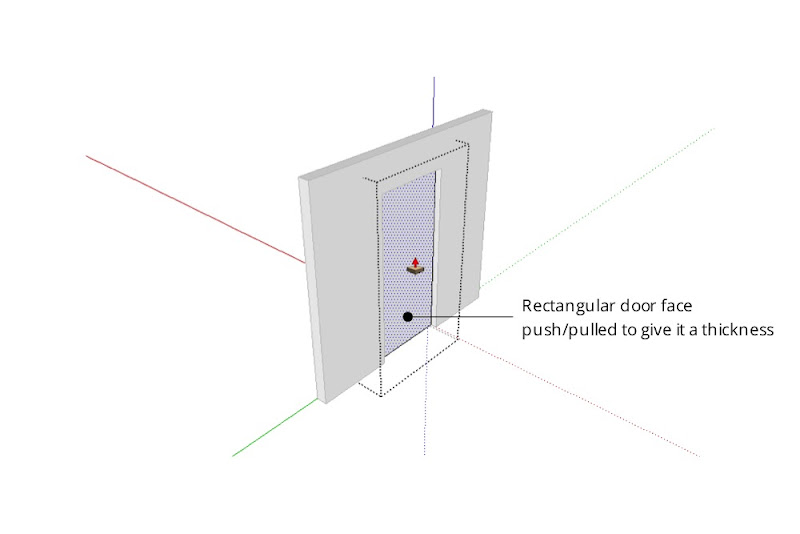
If you like, add detail (like a thickness) to the door you just modeled.

Extruding the single face into a 3D object will make it read better in plan. Resist the temptation to add doorknobs, detailed woodwork or anything else that isn't in keeping with your model's current level of detail.

Step 5
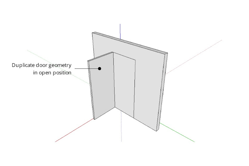
Model the same door in the open position. Be sure not to duplicate the component instance you made in the previous step — the whole point of this exercise is to have two, separate components.

Model the same door again, this time in the open position. For accuracy, line up the edges where the hinges would be on a real door.

Step 6
Turn the open door into a new component. Call it something like “Door-36-L-Open”.

Make the open door into another component and name it accordingly.

Step 7
Select the open and closed door components and make a new component that includes both. A good name for this component might be “Door-36-L-Main”.

Select both door components (open and closed) and make them into a new component.

Using Layers to control component visibility

The next step is to put each sub-component on a separate layer:

Step 1
Choose Window>Layers to open the Layers Manager.

Step 2
Create a new layer called “Doors-Open”.

Step 3
Create another layer called “Doors-Closed”.

Use the Layers Manager to create two new layers.

Step 4
Choose Window>Entity Info to open the Entity Info dialog box.

Step 5
Start editing your Main door component (the one that includes both sub-components) by double-clicking it with the Select tool.

Step 6
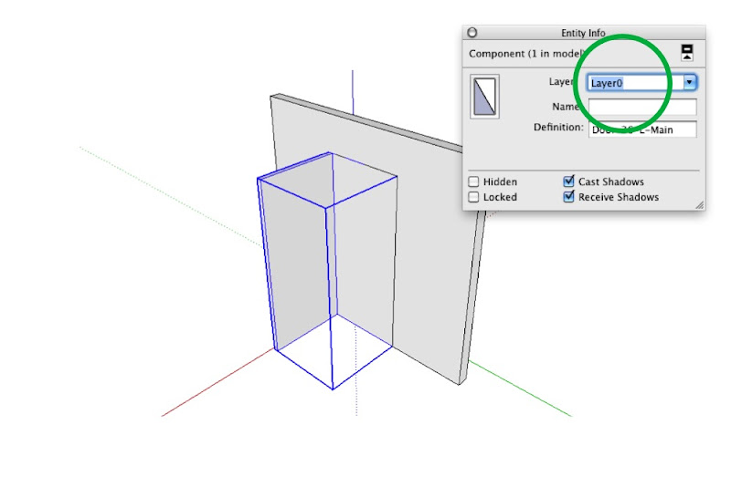
Select the closed door sub-component and move it to the “Doors-Closed” layer using the Layer drop-down menu in the Entity Info dialog box.

Move the Closed Door sub-component to the "Doors-Closed" layer using the Entity Info dialog box.

Step 7
Select the open door component and move it to the “Doors-Open” layer.

Put the Open Door sub-component on its own layer, too.

Step 8
Click elsewhere on your screen to stop editing the Main door component.

Make sure the Main Door component (which includes both sub-components) is on LayerO. If you're really advanced, I suppose you could even have a layer dedicated to these "combo" door components. Tread lightly, though—layers can be tricky to work with.

Setting up Scenes to control layer visibility

After you’ve placed doors wherever you need them in your model, you can control which set is visible by creating (or updating) scenes that show only one “Doors” layer at a time. It’s pretty straightforward, really:

Step 1
Activate the scene that corresponds to a plan view of your model. If you don’t have one yet, just create a new scene called “Plan” and worry about getting the camera position in order later.

Right now, both the Doors Closed and Doors Open layers are visible. We only want the open doors to appear in the above plan.

Step 2
In the Layers Manager, hide the “Doors Closed” layer.

Uncheck the Doors Closed layer to make its contents invisible.

Step 3
Right-click the “Plan” scene tab and choose Update.

When the doors look the way you want them to, right-click the relevant scene tab and choose Update.

Step 4
Repeat the above three steps for any other planimetric scenes in your model.

Step 5
Go through the above process again for any scenes where doors should appear closed.

In the above elevation view, I want only the Doors Closed layer to be visible.

Dealing with doorways in section

What about doors that are cut through by section cuts? They shouldn’t appear at all. The solution here is simple: Just hide the offending door components and update your scene.

Doors which are cut through in sectional views shouldn't appear at all. Those which appear in elevation (like the one on the left) should appear closed.

Simply hiding door components you don't want to see (then updating the corresponding scene) is the easiest way to deal with this conundrum.

One more thing: I've added the above example model to the 3D Warehouse so you can download it and do some of your own experimenting. You can find it here (click the 3D Warehouse logo to go to the model in the 3DWH):


Thursday, June 23, 2011

Quick and dirty poché for sectional views

While putting together a demo SketchUp file to use in our booth at the AIA National Convention last month, I worked out a nifty little technique that I think is worth sharing. Here’s hoping you think it’s nifty, too.

The problem I was trying to solve was this: SketchUp’s Section Plane Tool cuts away parts of a model to show sectional views, but it doesn’t “fill in” the spaces between wall surfaces, floor slabs and other areas that are intended to be solid in a design. Often, architects will blacken or hatch these interstitial areas to help their drawings read better. This filling-in is called poché, and SketchUp simply doesn’t offer an automatic way to do it.
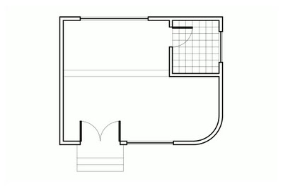
By default, SketchUp thickens section cut lines, but the spaces between the faces aren't filled in (above).
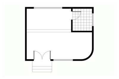
Sometimes, it's useful to show section cuts with solid shading.

I wanted the SketchUp file I was preparing to look "pochéd" no matter where it was sliced. Furthermore, I wanted that poché to carry over when the model was inserted into LayOut.

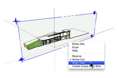
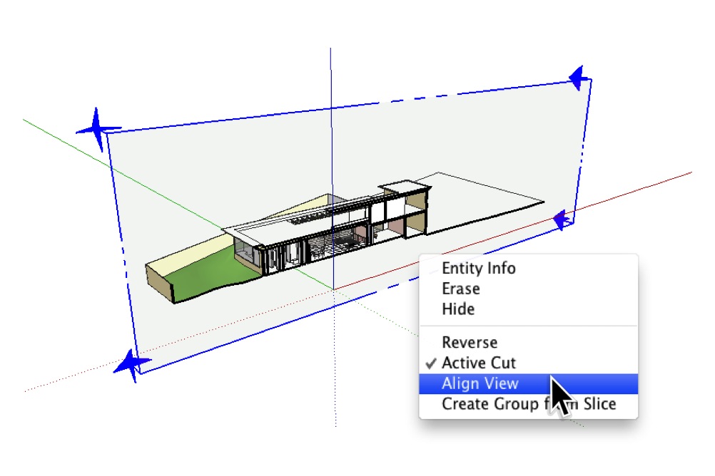
I started by using the Section Plane Tool to cut a section through the model (as seen below). I oriented my view to be perpendicular to the section cut by right-clicking the section plane object and choosing Align View. Since I wanted this to be a true, scalable orthographic view, I turned off perspective (Camera > Parallel Projection). Finally, I created a new scene; doing so made navigation easier, and was necessary for creating a viewport in LayOut later on.
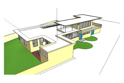
An overall view of the model

After adding a Section Plane, I right-clicked and chose Align View.
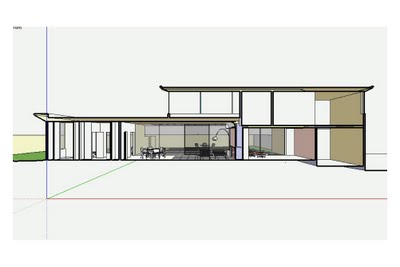
This is the right view of the model (above), but true orthographic projections don't include perspective.
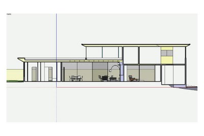
Choosing Camera > Parallel Projection from the menu bar turned off the perspective.

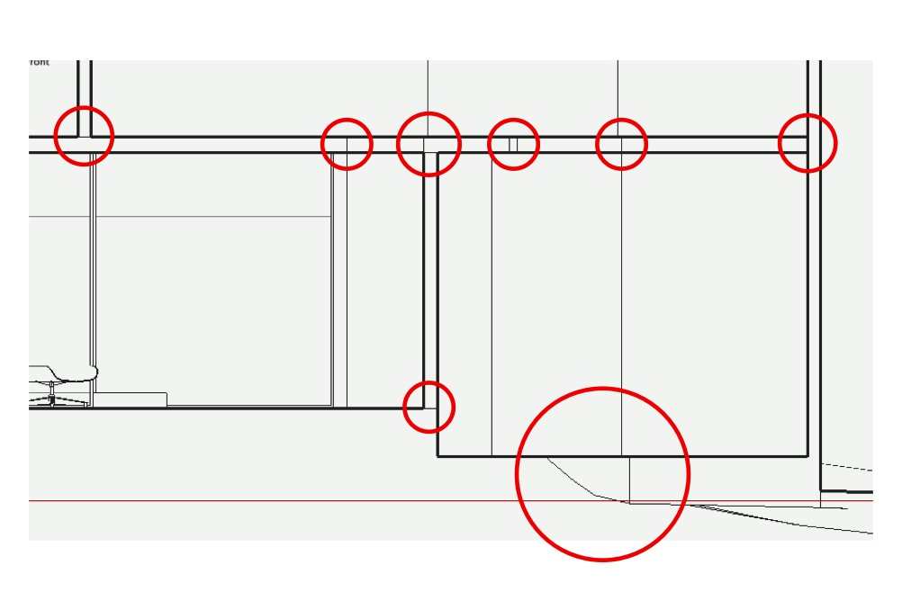
Now for some work with Styles: As this would be a black and white, sectional view, I chose to apply the HiddenLine style from the "Default Styles" collection that ships with every copy of SketchUp. This style uses thickened edges to indicate cut-through faces, but (as I mentioned earlier) it doesn’t fill in the areas between them. Perhaps more annoyingly, edges which exist beyond the section cut still show up in cut-through areas (see below). This is visually distracting and not at all acceptable for professional work. If I’d turned in drawings that looked like this in architecture school, my professor would’ve made me run laps around the studio.
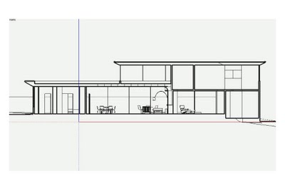
Applying the HiddenLine style turns the model black and white, but there are problems.
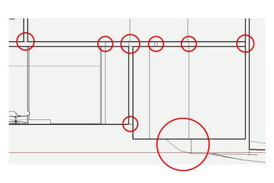
Edges which exist beyond the plane of the section cut are plainly visible. This isn't desirable.

Revelation #1: Monochrome is the answer

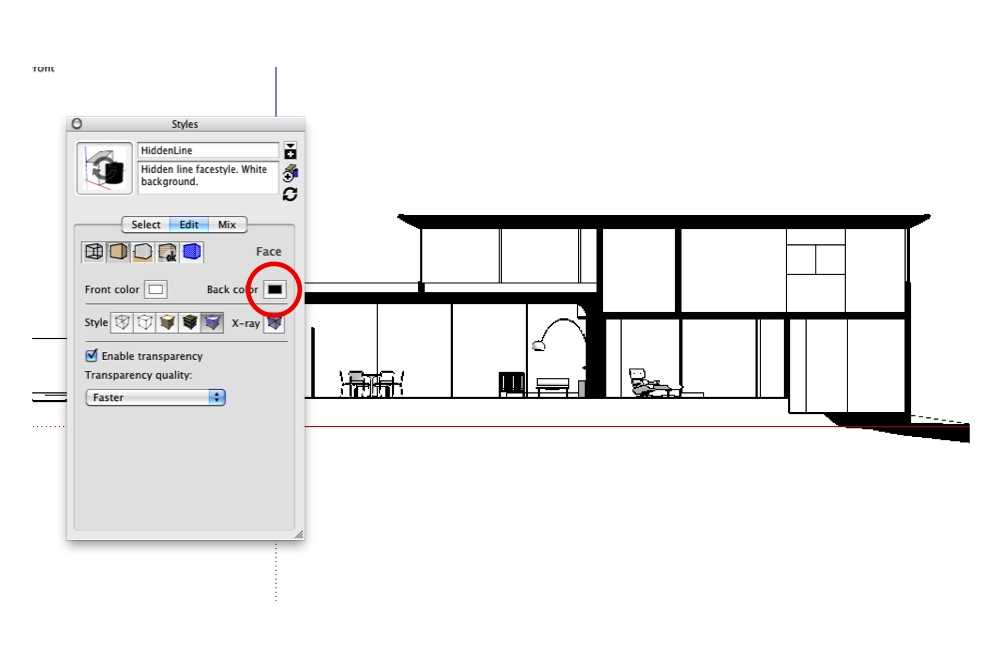
This helpful post from last year gave me the idea to use the Monochrome face style to automatically turn the “fronts” of my faces white and the “backs”, black. See the following image for a visual explanation of what I did.
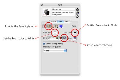
I selected the Monochrome face style and chose white and black for the default front and back face colors.

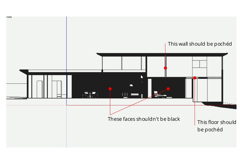
The above settings work well, except where faces are "inside-out".

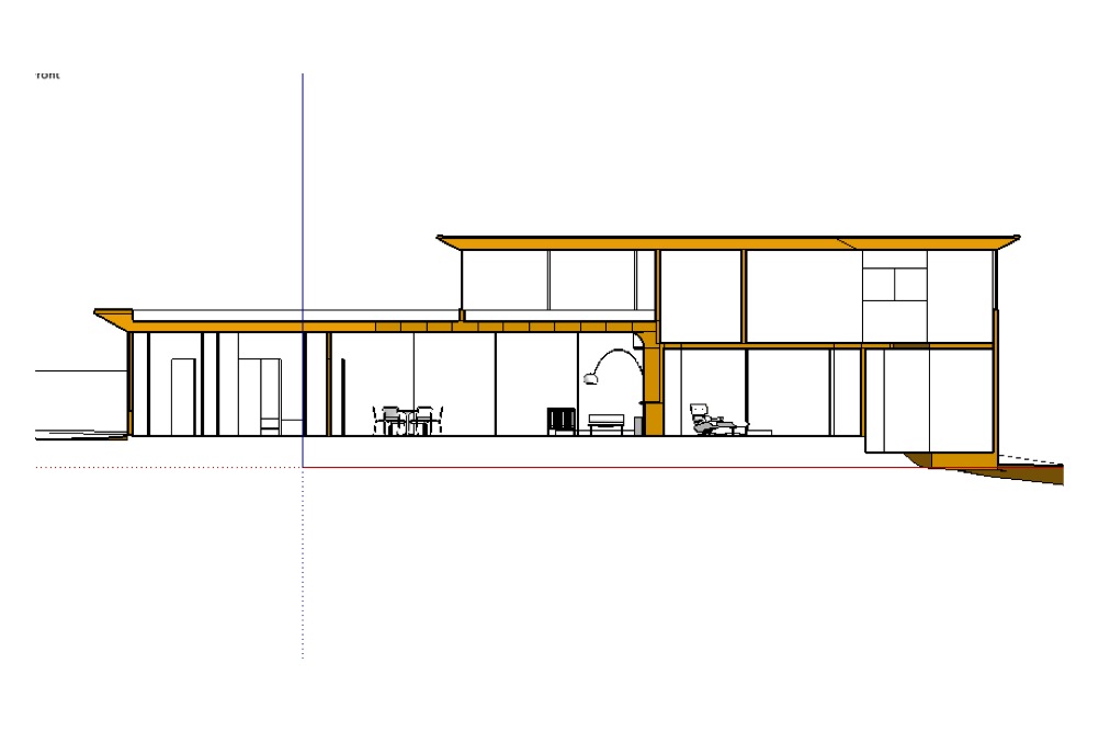
Hmm. It was clear that I had a little cleanup work to do; some of my faces were oriented so that the back-side was facing out (above). To make it easier to see what I was doing, I changed the Back Color to something lighter than black, then spent a few minutes turning the offending faces right-side-out by right-clicking them and choosing Reverse Faces. I ended up turning off Section Plane object visibility (View > Section Planes) to make faces easier to select.

Temporarily changing the default Back color to yellow made it easier to see what I was doing.
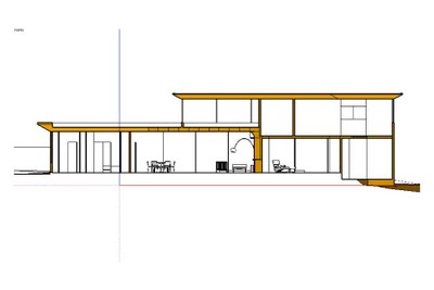
I spent a few minutes reversing the offending faces.
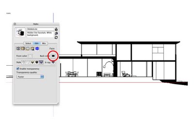
When I was done, I set the Back color back to black.

Revelation #2: Slim down section cuts

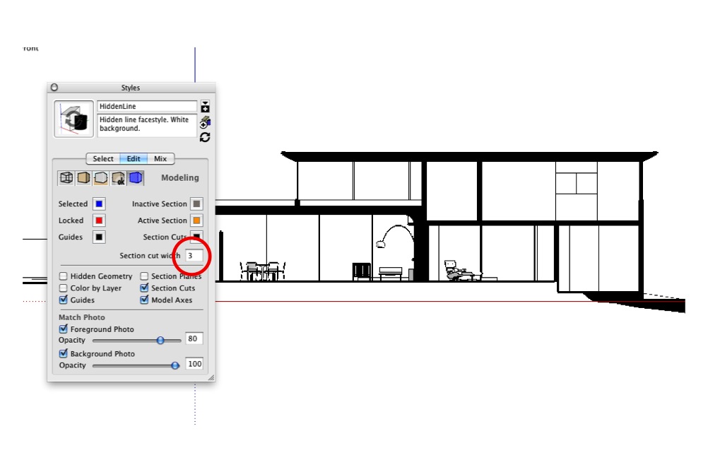
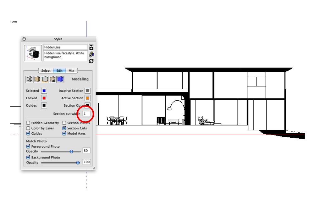
My next problem was easy to solve. The thickened-edge effect that makes section cuts stand out looked too heavy when combined with my newly-pochéd in-between areas, so I made them thinner. You’ll find this setting in the Modeling tab of the Styles dialog box (see below).
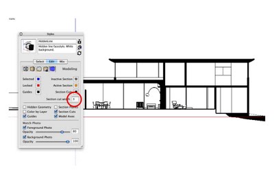
The default section cut thickness setting of "3" looks too heavy when combined with poché.

A setting of "1" looks much better.

Revelation #3: Hide Section Planes

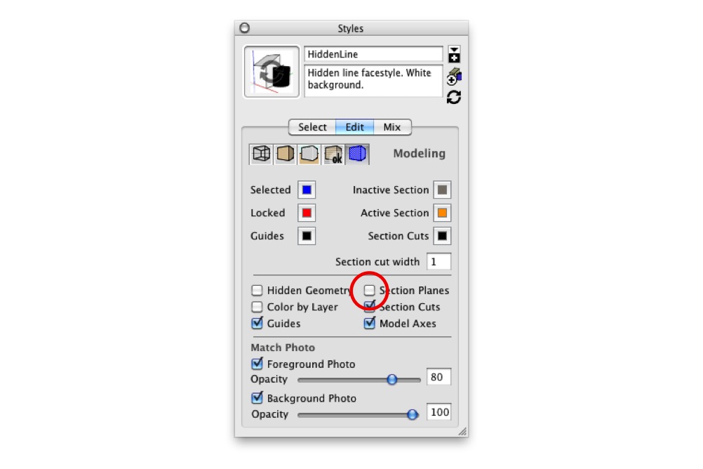
While I was in this section of the Styles dialog box, I made sure Section Plane objects would never be visible when my style-in-the-making was applied. I deselected the Section Planes checkbox.

Uncheck the Section Planes checkbox while you're in this section of the Styles dialog box.

Revelation #4: Eliminate roundness shading

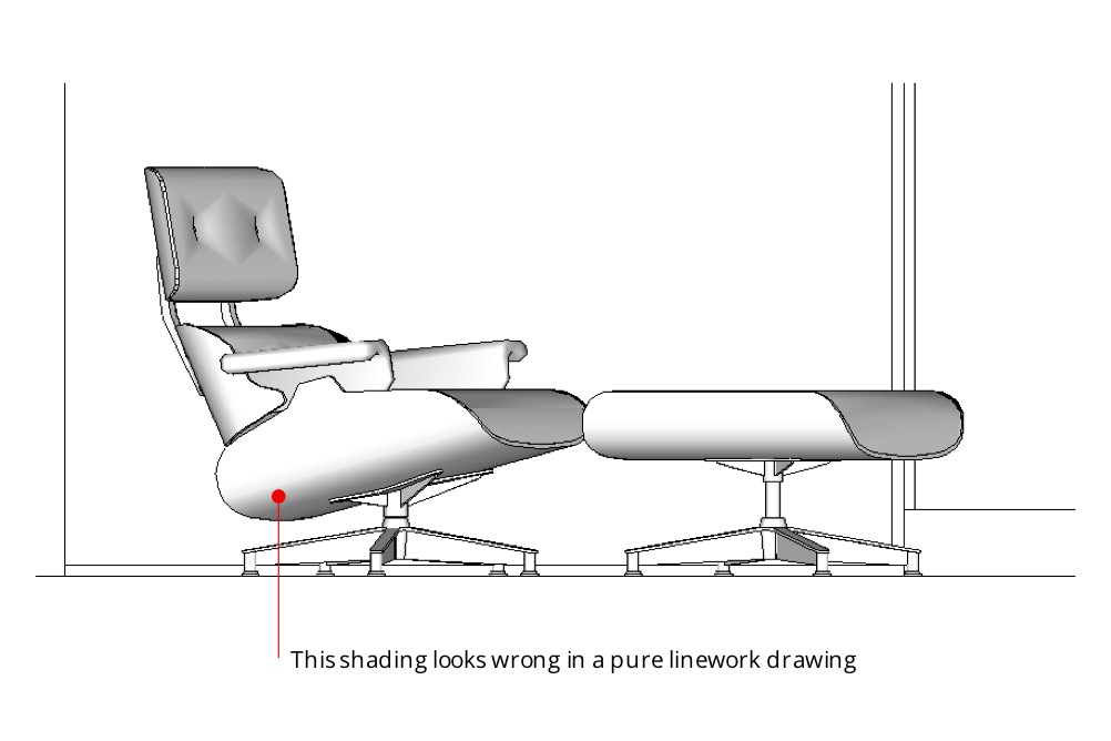
The next challenge I faced was a little trickier. In the following image, notice the shading gradient that defines the curvature on the underside of the Eames lounge? On a true, linework-only drawing, this shading wouldn’t be visible.
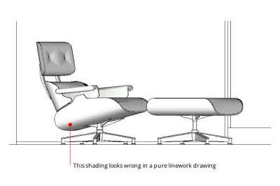
The shading in the above image looks nice, but it isn't appropriate for the drawing type I'm trying to create.

This shading is an automatic result of SketchUp’s built-in rendering engine. It’s usually very useful, but I wanted to get rid of it. After messing around for a few late-night minutes, I figured out how. The key is to do two things:

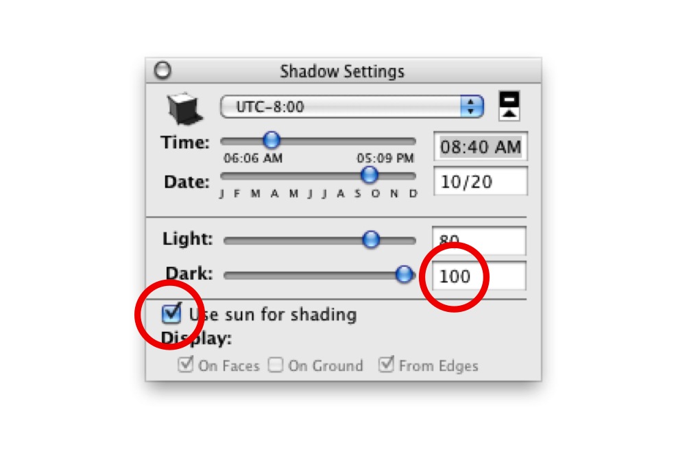
  • Turn on “Use sun for shading”. This tells SketchUp to use its shadow engine to render faces, even if shadows are turned off (which they probably should be).
  • Move the Dark slider all the way to the right. A setting of 100 for Dark means that shadows basically aren’t visible. This eliminates all curve shading in your model.
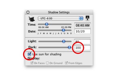
Turning on "Use sun for shading" and setting the Dark value to 100 effectively eliminates roundness shading.
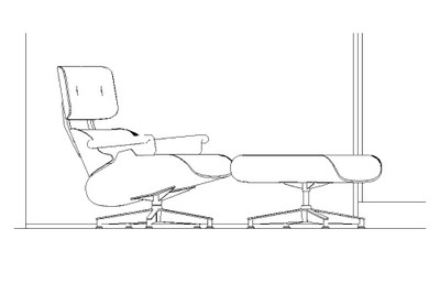
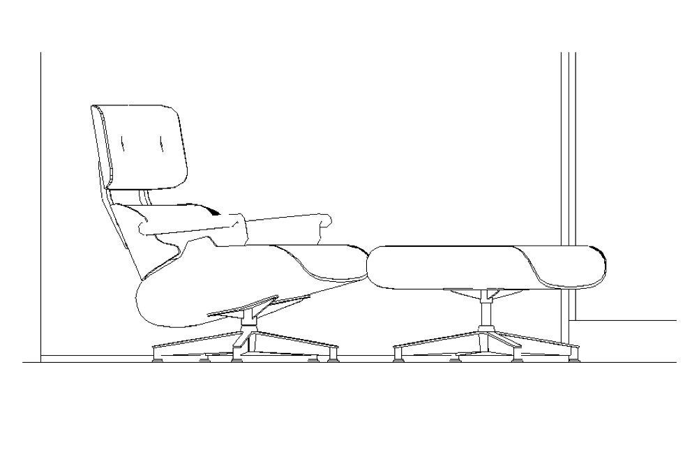
Having removed the shading, I'm left with pure black and white linework.

Revelation #5: Set Profiles to "1"

In keeping with my earlier discovery of the benefits of setting my Profile thickness to “1” (instead of “0”), I did so. This allowed curved, multi-faceted surfaces to appear outlined without making the boundaries of every group and component in my model look too thick. The images below show the before and after. Much better.
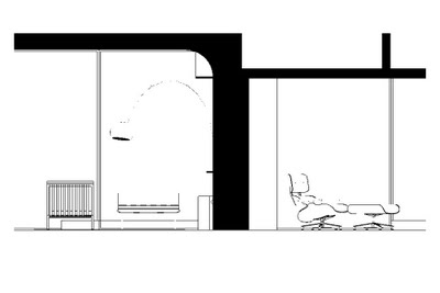

With Profiles turned off altogether, some rounded objects aren't visible.
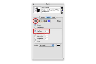
Control Profile settings in the Edge section of the Styles dialog box.
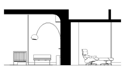
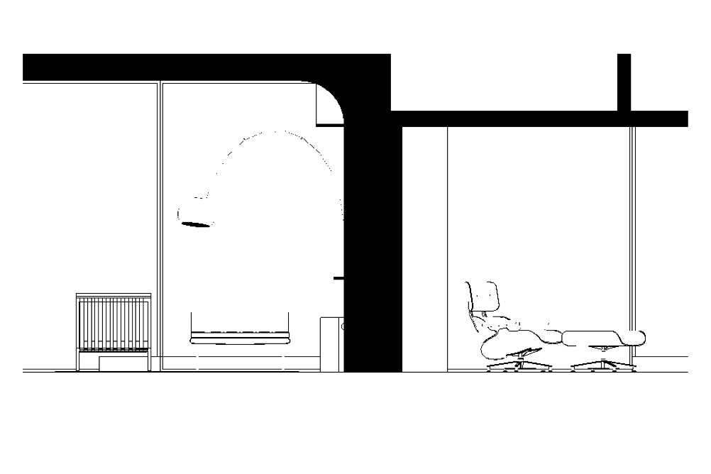
With Profiles turned on and set to "1", rounded shapes like the lamp on the left are clearly visible.

One more thing

I wanted a nice, thick base for my house to sit on, so I modeled one. Since the base was hollow, the poché trick worked here as well.
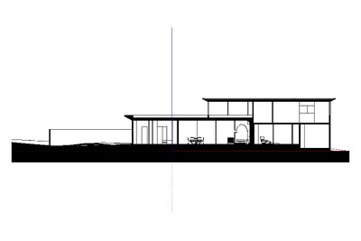
I added a thick base to the model.

When everything was set, I created a new style and called it "Section Cut". With this style applied, things looked just the way I wanted them to, no matter where I cut through my model.
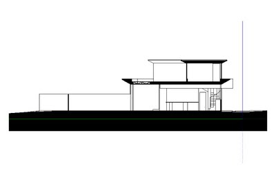
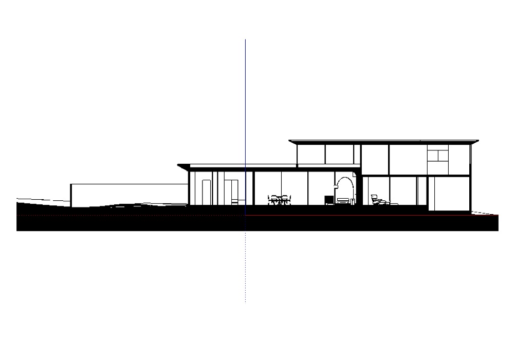
Short section through the same building
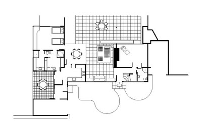
The poché trick works just as well on plan sections.
Related Posts Plugin for WordPress, Blogger...