Sunday, September 30, 2012

Trip to Japan ~ Simply, Food

When people ask me what I miss the most about Japan, one of the first things that comes to mind is FOOD. Seriously, isn't that a basic need and desire of human nature? There are some Japanese foods that I could buy where I live, but not like actually living there.

When I had a family trip to California a couple years ago, I made sure that we would hit the Japanese grocery stores there. I was amazed with the selections... yeah... I was in heaven!

For the first time in 11 years, I was actually in Japan. Not in California, not in little Tokyo... real Japan! You might laugh at me, but I had a list of things I wanted to eat while I was there. I felt like if I miss this chance; who knows when my next chance will be?

My family and friends laughed at the list at first, but they were really helping me to cross the items off the list.

They took me to "kaiten-sushi". It is a sushi restaurant that you sit around and a conveyor belt brings the food and you grab a dish with sushi on it. They are so much cheaper than traditional sushi restaurants. Most of the dishes are 105 yen (which is about $1.35 right now). You may not believe me, but I can really pack them in when I am hungry. :)

I was so surprised to see the restaurant. There were few things that had changed since I left; the lay out of the seating arrangement was different, I mean instead of sitting around facing the conveyor belt;, there are booths around the belt, and you can order whatever you want from a touch screen at your booth. The dish stops at your booth and the light flashes to tell you that your sushi has arrived. Things change so much in 11 years! I had to take a pictures at this new found Japanese culture.

You just order what you want, and they will make one right there for you.

There were really good selections. Yeah, they are not same as you eat at real sushi restaurant, but they are pretty good. If you take someone like me, who was starving for Japanese food in general, I was like a kid in a candy shop.

Mmm... Am I done? Well, let me rest for a minute, I think I can go for some more.

When I had small class reunion, we met at an awesome restaurant, there I had bunch of yummy food (which I was able to cross some stuff off my list as well)...


When my mom and my sister took me out for shopping, we had lunch at the restaurant as well... Oh, they were so good...

Am I done yet? No, no way, I had to eat some Japanese junk food as well.

There were LOTS more other things that I ate, but forgot to take pictures because I was too excited about it. Such as ramen, Japanese style Chinese food (oh, they are soo good), very yummy cakes, and best of all, the home cooked food by my mom and my sisters. They are all excellent cooks, and I was so spoiled while I was there. Thank you everyone for feeding me!!

Has reading about all this food given you heartburn yet? There are a couple more pictures to share with you...

Tada! You know what, they are not real food. They are actually samples made out of wax to show what you can expect when you order that dish. I believe this was invented in Japan, and pretty much any restaurant you go to, you see samples like this in front of the place.

Japanese style kid’s meals... I was missing my family and wanted to show this to my kiddos.

I ate so much while I was there. I am paying the price for it right now, but it was totally worth it!

{ Open Call For: Next Home Show Designer Contest }

Link up 
October 1 - November 1, 2012
Winner will be featured at

We are searching for an up and coming Decorator, Designer, or DIYer to feature his/her UPCYCLING design flair at the 2013 Philadelphia Home Show. The winning designer will be given a space to design (top to bottom) at the show to be seen by over 50,000 home owners in the Philadelphia area!

Show us some examples of your creative design projects, which should feature OLD items that have been refurbished, upcycled, and re-purposed.

What we are looking for
  1. Creativity
  2. Innovation
  3. Use of current design trends
  4. Creative upcycled items incorporated into the design
  5. Quality of design and items used in design
  6. Quality of photos
  7. Entrant follow all party rules
Rules and Policies
Rules of Eligibility
  1. Entries must be relevant to the interior design upcycling theme. You may link up as many relavant projects as you like.
  2. Projects/designs MUST be your own work.
  3. All entries must be submitted by November 1, 2012.
  4. You must include a linked party button in ALL linked project posts.
  5. Appreciated: include the linked party button in your side bar.
  6. Appreciated: Please subscribe to and/or follow The Painted Home.
Philadelphia Home Show Event Policies
  1. Entries will be narrowed to (5) five finalists whom will them be interviewed to determine the winner.
  2. Winner must commit to completing a room at the Phialdelphia Home Show 2013.
  3. PHS room measures 12' x 20' and include 3 unfinished hardwalls.
  4. Move-in/set up for the room will be January 29 - February 1, at the PA Convention Center; Show dates are February 2 - 10, 2013.
  5. Winner must have his/her room finished by 4pm on Friday Feb. 1.
  6. Decor for room includes flooring, wall covering, furniture, and decor items.
  7. Complete move-in/set up instructions will be shared with the five finalists.
  8. Winner can be onsite at the show to promote his/her designs, but is not required to be.

BUTTON REQUIRED IN EACH LINKED POST
Here is the button you should include in each of your linked posts.


SUBMIT YOUR ENTRIES BY LINKING UP BELOW
NOTE: Post must meet the rules above.


Kitchen // Shopping Guide


So you have likely seen our Kitchen Reveal and tips and tricks for buying Ikea Kitchens.  This particular post is going to tell you where we got everything else - the essential elements in making our Ikea Kitchen look custom. Things like what hardware, countertops, sink, faucet etc.... This is a long post so all the info is after the jump. Cheers! - Lindsay

Read more »

ADAC Opens its Doors

If you live in Atlanta and are exposed on any level to the world of design, then you most definitely have heard of ADAC.  Until now, ADAC was a place for designers to visit, but the general public wasn't allowed access.  As of tomorrow, October 1st, any and all will be welcomed inside the campus consisting of 550,000 square feet with 60 showrooms offering 1,200 of the industry’s finest product lines including furniture, fabric, rugs, lighting, accessories, floor and wall coverings, antiques, fine art and framing, kitchens, bath, tile and stone, and home theater product.  It is an exciting venture for ADAC and the entire design community.

To kick things off there will be two weeks of events open to the public as well as designers.  For a detailed calendar of events you can visit ADAC's website.  You can register for any of the events listed by going here.  On Wednesday, October 10th, I'll be speaking along with five lovely ladies, Shelly Hart of Design Indulgence, Erika Ward of BluLabel Bungalow, Claire Watkins of High Gloss Blue, and Helen Young of Whitehaven; moderated Wendy Shannon at With a Southern Twist.  We'll be dishing about what is in, what is out and what is hot in the world of blogging and design.  Please join us!  It's a really fun group and I'm sure you will be entertained.


Soft and Sweet


                                                                          Hello Everyone!
                         I hope you had a good weekend. We had heavy rain most of the weekend but it was nice and warm at least. I went to an auction sale on Saturday where there was lots of interesting pieces that went pretty cheap.I got a little table and a vintage galvanized cooler for $5 and a mirror for $7 so I was happy with that.I wish I had taken my camera to show you some of the unusual pieces like a buttercup yellow vintage  stove.
Since I didn't take any photos this weekend I am sharing some mosaics that I like from my vast collection!

                                                    Hope you all like dishes as much as I do!
                                            Our little green and white toile  guest room.
                                   The blue and white teacups are Spode
                      Our blue and white guest room-at one time our bedrooms were all  used but alas our children have all grown up .
                                                                      Vintage china
                                                                    I love this teacup.
                                                 Some of my teapots and teacups.

   Well that's it for today but thank you for visiting me. I am hoping the sun shines soon as I have some painting I want to do before it gets too cold.

Thank you for visiting,
Carolyn

Quiet Time

Only God can tell a questioning heart to stop asking and start living out the answers.
-From Heart of My Heart by Kristin Armstrong

Favorite Flower Combinations in 2012 - Part One

Cottage garden. May 1, 2012
Shades of purple and pink tumble and intertwine along one of the paths in the cottage garden. In the correct zones, these perennials are reliably drought tolerant and will provide a long bloom season.

To recreate this combination in a hot, full sun location, use the following plants (Click the links for each plant to read previous in-depth articles):

Perennial heliotrope (heliotropium amplexicaule). Zones 7-11, deer resistant
Wine cups (callirhoe involucrata). Zones 3-9, NOT deer or rabbit resistant
Salvia greggii 'Diane'. Zones 7-9, deer resistant
Salvia nemorosa Bordeaux 'Steel Blue'. Zones 4-8, deer resistant


Words and photos by Freda Cameron, Defining Your Home, Garden and Travel. Deer and rabbit resistance varies based upon the animal population and availability of food. All company or product or patented names mentioned are registered trademarks, copyrights, or patents owned by those respective companies or persons.

Revisited: Beadboard Garland for Fall

Here’s one of last fall’s projects—I thought I’d pull it out again for this year!

candy corn banner

*******************************

I love the look of beadboard, and I’ve been using it for signs for months now (you can see some here), …but I also love the look of pennant banners, so I thought, “How about a beadboard pennant banner?”

Why not?
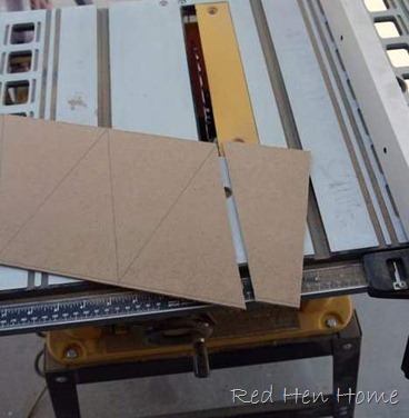
The first step is to draw out your pennants. There is no magic formula here, just do whatever looks good to you. My pennants are 7” long, and 5” wide at the top. I marked the top and bottom at 5” intervals, except I started the markings on the bottom after coming in 2.5” (because that’s half of 5). Then I just had to connect the dots!
fall 024
Once my lines were all drawn, I used a table saw to cut along the lines. Note: You could also use a jigsaw if you don’t have a table saw!
fall 025
Once you get the first piece off, you can use a fence to cut your parallelograms easily…
fall 026
fall 027
…but that’s not going to help when it’s time to cut the triangles off!
fall 029
I ended up with ten little triangles. Rather than drill each triangle separately, I stacked them and clamped them together. Then I could drill five at once! This is a great time saver.
fall 030
I base-coated all my triangles with Rustoleum Heirloom White spraypaint, but then I decided to get further color inspiration from candy corn! I used acrylic craft paint, and didn’t even worry about getting lines perfect or anything. Have you ever seen a perfect candy corn?? Another Note: OK, so now I know that candy corns are actually yellow-orange-white and not orange-yellow-white. Sorry! I don’t actually eat them! Bleah.
fall 031
I used black acrylic paint to stencil on letters…
fall 032
…and the next day I distressed and glazed all my little pennants.
bead board pennant banner
I tied the pieces together with twine, and anxiously hung my banner on my buffet so I could admire my handiwork!
fall 034
Whoops!
***blush***
Oh, that’s much better!
candy corn banner
I like the little-bit-faded look the pennants have.
candy corn banner
No tricks for me….just treats, please!
beadboard pennant
Want some other ideas for an Autumn banner? Well, how about a banner that just says “autumn”? The one below was actually the first one I made. For this one, I use vinyl as a “reverse stencil,” and sprayed the pennants with Rustoleum Summer Squash paint. You may notice that these triangles are all equilateral, so you can make any size/shape triangles you like!
fall 008

This particular banner now lives on my sister’s buffet!
I like this little “fall” banner with the different fonts for each letter.

guest 007
The possibilities are endless! What would you put on a banner?

(and if you don’t want to make your own…contact me through my Etsy shop and I’ll make one for you!)

***********************************************************
This project has been featured at Elizabeth & Co.
******************************************
Linking up here:
Domestically Speaking Elizabeth & Co.
  The CSI Project
Friday Remodelaholic 2805
My Simple Home Life’s Simple Creations Friday  
Funky Junk’s Saturday Night Special The DIY Show Off
Stone Gable
Beyond the Picket Fence Someday Crafts
Knick of Time
Mod Vintage Life
My Uncommon Slice of Suburbia
Perfectly Imperfect {Primp}
Common Ground My Repurposed Life
From My Front Porch to Yours All Star Block Party
A Little Knick Knack
Cowgirl Up!
The Graphics Fairy
{aka} design
Coastal Charm

Saturday, September 29, 2012

Link Love No.83!

So, I have been sharing the stories of my trip to Japan, and there are many more to tell. Also, every year I have been doing a Tea Rose Home blogaversary giveaway in September, but I haven't done that because I have been away... I am going to do that with some goodies I brought from Japan soon! So stay tuned. :)

Are you ready for the link love for this month?

I have seen so many bookends before, but this one is such a cutie! Annemarie's Haakblog shared these crochet bookends. Things like this put a smile on my face.


Have you already decorated your house for the upcoming season? Cherished Bliss used orange and aqua to decorate her home for the fall and shared the pictures on her blog. You should visit there to see them, because they are stunning!


If you are a biker or not, you will love this picture drawn by Grow Creative. I love the use of colors, they are simply adorable.


Blue Bird Sews shared this great tutorial for stretching wonky stars to make a baby quilt. I LOVE the fabric she used for this project, and the quilt design goes so well with it.


I love projects that use something worthless or ordinary and come up with jaw dropping creations. Carolyn’s Homework has done just that... She used brown paper bags from the grocery stores and created this amazing faux bay leaf wreath! I would love to give it a try.


Thank you everyone for sharing your talents!

I will be back with more stories from trip to Japan this week, see you at the next post. :)
Related Posts Plugin for WordPress, Blogger...